via http://www.theatlantic.com
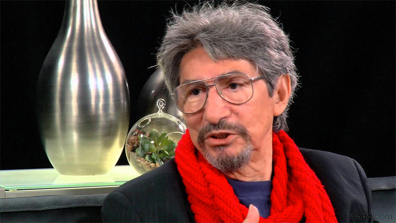
Anyone obsessed with film title design will recognize the name Pablo Ferro. The artist disrupted conventions starting with Stanley Kubrick’s Dr. Strangelove, where Ferro famously dwarfed all the leading cast and production names by making the “and”s, “with”s, and “the”s extra prominent.
His titling, crudely handwritten in both elongated and condensed letters, stood apart from the rest of the field. Ferro (b. 1935) went on to design titles for influential works including The Thomas Crown Affair; The Russians Are Coming, The Russians Are Coming; Harold and Maude; and Bound For Glory. He also reprised his Strangelove letters for Men in Black and Stop Making Sense. Using his inventive, fast-cut editing technique, the former comics artist and animator also created countless TV commercials, movie trailers, directed his own shorts and a feature length film, Me, Myself and I, with George Segal and Jo Beth Williams.
Now in Pablo, a documentary by Richard Goldgewicht available on DVD/on demand and coming to theaters soon, he gets his own time on screen.
Goldgewicht met Ferro while interviewing him for a segment of a TV pilot on independent cinema. “The pilot never aired, but the segment, which was about seven minutes, got a lot of good feedback, and the producers started presenting it as a short film in a couple festivals and showcases,” he told me. “From there on I felt like it would be a great opportunity to make a whole film on Pablo, not just featuring his works but looking into his whole life, which I quickly realized was full of interesting contradictions and artistic turns.”
The original impetus behind the film was to tell “the story of some of the greatest films in American cinema through the perspective of a graphic designer,” Goldgewicht said. But he was also drawn to project because of the Cuban-born, New York City-raised Ferro’s Zelig-like presence in New York’s ‘60s counterculture, and his relationship to directors Kubrick, Hal Ashby, Norman Jewison, Jonathan Demme, among others.
Ferro has always been wildly creative, with emphasis on wild, which is vividly clear in the documentary. Ferro was rebellious but productive. He made commercials that prefigure today’s music videos and invented techniques, including the multiple-screen approach in Thomas Crown, that were used extensively by others as a defining style of filmmaking during the late ‘60s and ‘70s. But there is more to Ferro than the work.
Goldgewicht wanted to capture Ferro’s deeper story, which he believed hinged on when the filmmaker was critically wounded in the neck while in his loft, by a gunman who mistook him for the person who lived upstairs. “The implications of him being shot and not knowing who did it, the ups and downs of his financial and professional life [as a result], the marriage break up, his relationship with Kubrick,” Goldgewicht said, “have a lot of open questions.”
Ferro is also decidedly elusive, which presented a challenge for Goldgewicht: “He’s been described by different people in very different ways, from the extraordinary avant-guard artist to the average-man to the Latin Hero to everything in between. So developing the film’s discourse was tricky. And then, of course, getting it funded and produced in a way that people would take notice was also a challenge.”
Goldgewicht would have had an easier job if he focused exclusively on Ferro’s film and television work, which is well documented. But capturing the protected life demanded creative narrative approaches, including animating certain aspects of Ferro’s story interspersed with real-life footage.
“The idea of animating the film opened up the playing field for all kinds of creative opportunities,” Goldgewicht said. “Firstly, Pablo is himself an animator, so the thought of making an animated documentary about an animator had a good ring to it. But the real reason was the content of our 40+ hours of interview archives with Pablo’s friends and collaborators. The transcripts amounted to a bible of over 1,000 pages and there were way too many great stories with absolutely no visual record. [Animation] quickly felt like a fun and alluring way of recapturing the magic of his life.”
Another way the doc filled in the blanks was with testimonials from the actors, directors, and crew who’ve come to admire Ferro over the years. Jon Voight, Robert Downey Jr., George Segal, Richard Benjamin, Stan Lee, Beau Bridges and more appear as talking heads, and Jeff Bridges narrates. Goldgewicht says it was “amazing to see how collaborative people were when we called up asking them to be a part in the Pablo Ferro documentary.”
It all adds up to a portrait that helps to illuminate what has made Ferro so important and beloved. “When I think of Pablo’s insights,” Goldgewicht said, “I think of the great soundbites we were lucky to have captured in our interviews. One that comes to mind right now is Anjelica Huston’s thoughts, when asked to describe the specific quality of Pablo’s artistry. She said: ‘I think it has to do with the God-given gift of talent combined with the kind of hard work that goes into making something look easy.’ I like that line, it makes a lot of sense to me.”
STEVEN HELLER is the co-chair of the MFA Design program at the School of Visual Arts and co-founder of the MFA Design Criticism program.
